Colors
How many Perler bead colors do you actually need?
The gap between a 72-color set and a 168-color set is real, but it only matters for certain kinds of picture. And more colors is not automatically a better pattern.
How many colors you actually need
Color count matters more than bead size for how a pattern looks, and it matters less than most people expect. The useful breakdown:
- 24 to 48 colors covers icons, ornaments, simple game sprites, bold outlines and classroom crafts.
- 72 to 96 colors is the practical middle. Enough range for fan art, home decor and pets, and enough shading to model a face without the palette becoming unmanageable.
- 120 and up is where skin tones and light transitions start to look natural rather than posterized.
Those numbers describe how many distinct colors a pattern uses, which is not the same as how many bags you buy. A 96-color pattern might call for 40 of them — with counts of 300 beads in the common ones and single digits in the rare ones.
The 72 and 168 sets
Those two numbers come up constantly because they are the common retail configurations. A 72-color starter set covers the basics and is enough for practice pieces and cartoon characters. The 168-color set exists for the opposite reason: natural transitions in skin and shadow, which flat cartoon shapes do not need.
Neither number is a quality threshold. A pattern that only uses 30 colors can look excellent; a pattern that uses 160 can look muddy if the extra colors are all near-identical shades of the same thing.
Brand color cards are not interchangeable
Every manufacturer numbers its own palette, and the codes mean nothing across brands. Perler P01 and Hama H01 are both white, and they are not the same white. Artkal's 221-color line and MARD's 291-color extended edition are large catalogs in a way that Perler's 117-color card is not — though published counts vary depending on whether glow-in-the-dark, glitter and metallic shades are counted, so treat any single figure with a little care.
Because the codes are brand-specific, a chart tells you which codes to look for, and the pattern library shows which card each one was made against. When you switch brands in the Studio, the whole palette swaps and the color list is rebuilt from the new card.

Why fewer colors often look better
Automatic color matching is fast, and it does not know what you care about. Run it on a photo and it will happily use 90 shades to represent a face that would read better in 12. The tell is scattered single beads in odd places, and backgrounds competing with the subject for attention.
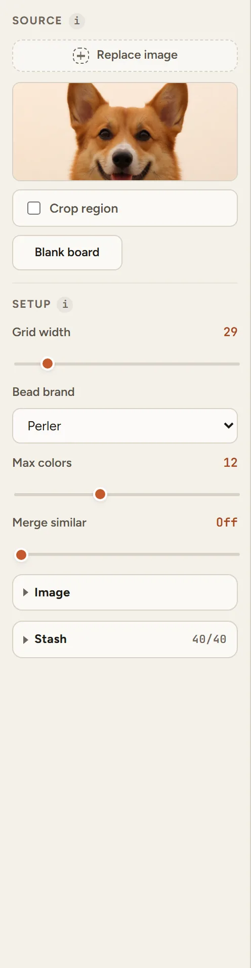
The fix is usually not more colors. Crop tighter so the subject fills the frame, lower the color cap, and let the merge-similar control fold near-identical shades together. Perler, Hama and Artkal also differ in how they melt, which is a separate reason to stick to one brand within a single piece.
Why the match sometimes looks off
Color matching runs through CIEDE2000 in CIELAB space, which is the part of the process that respects how you actually see color. It is also why a photo of skin tones survives the conversion better than a flat RGB distance would manage.
Even so, the algorithm has no idea what matters to you. It will happily spend a color on a background speck that reads as noise, or leave a face flat because no single bead in the card matches the exact shadow. That is what the manual cleanup tools in the Studio are for — paint, erase, fill and pick, straight on the canvas.
Questions
Is a 72-color set enough?
For most projects, yes. It covers the common colors and handles practice pieces, ornaments and cartoon characters well. You will notice the limit on smooth gradients and skin tones, where the pattern starts looking stepped.
Is a 168-color set worth buying?
It depends on what you make. If you mostly build sprites, flat characters and simple shapes, the extra shades add cost without adding anything visible. If you convert photos of people or pets, the wider range is where the difference shows.
How many colors do the big brands actually have?
Perler around 117, Hama around 89, Artkal over 200, and MARD has both a 221 and a 291 version depending on the set. Published counts differ a little depending on whether glow, glitter and metallic shades are included, so treat these as approximate.
Can I mix colors from different brands in one project?
The beads are the same physical size, so they will fit the same board and fuse the same way. The practical problems are color matching and shrinkage: the codes do not line up across brands and different plastic batches can shrink differently, which shows up as warping. Use one brand per piece if you can.
Why does my converted pattern look muddy?
Usually too many similar colors spread across the image. Crop closer to the subject, lower the max colors setting, and turn on merge similar. The goal is fewer, more deliberate colors rather than a more accurate photo.
Should I buy loose beads or a kit?
Kits are convenient and cheap for a fixed set of colors. Loose beads make more sense if you already know which colors a pattern needs, or if you want to top up the shades you actually use. Either way, black, white and neutral greys get used first and run out first.